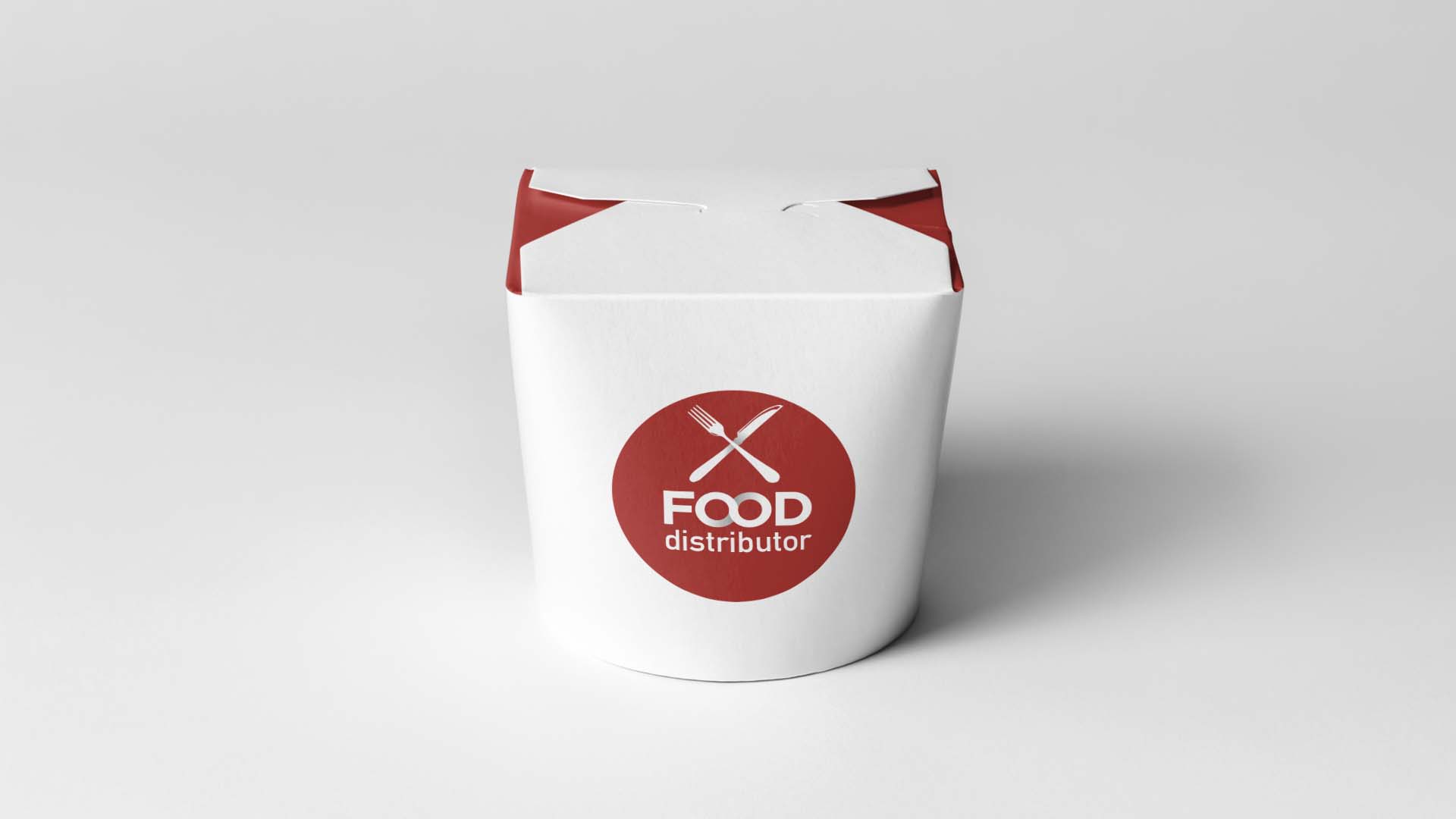
The infinity symbol on the two "o" of food recalls the concept of the distributor: a more harmonious and healthier food with respect to our body and the planet. It recalls the idea of sustainable development and the consumer's desire to eat a balanced diet.
The red comes out of the traditional green and thus avoids "greenwashing" at McDonald's.
The cutlery evokes a real meal and not a sandwich taken on the go.